These pictures were taken during our field trip to Orchard Road. We were given tasks to complete during our field trip such as taking pictures of some of the businesses and also exhibitions displayed there.
These brands shown here have different images.
For Dior, the image of the shop is very neat and clean. As you can see, the main colours used is black and white. The logo of Dior is simple yet it gives off a very elegant and classy feeling.
For Dolce & Gabbana, the outer layout and design of the store is bit complicated. For the outer design of the store, they use the colours black and white, while on the inside, they use other colours such as brown ( alike to a wood colour). The store gives off a luxurious feeling.
For Louis Vuitton, the main colours that they use is also black and white. The logo is simple yet elegant.
For Prada, the logo is a little too dark as compared to the outer design of the store. The logo seems to be hidden amongst the outer design. The store layout gives off a very classy feeling to the store, following the arrangement of the mannequins.
Finally as for Giorgio Armani, the design of the outside of the store is very dark, whereas the above the logo, it is rather bright. The logo is simple and shows a very sensual and elegant image. Personally, I feel that the outer design doesn't go well with the brand logo and brand image. the outer design should be a little brighter. The logo should also be a brighter shade of white.
The 2 pictures above are advertisements placed on the sides of escalators. For the first image, the advertisement is about sunglasses. The theme of the advertisement is about summer. They use very bright colours like blue and yellow to make the advertisement colourful. Maybe they used the colours blue and yellow to represent the beach, ocean and sun which are often associated to summer.
As for the second picture, the advertisement is about watches. This advertisement gives off a more elegant and simple feeling. The main colours that they use are orange and black. The colours that they use serves its purpose to give off a simple feel to the advertisement.
These are the logos of 2 of the food stands located at the basement of Takashimaya. The similarities between these logos are that they use an animated mascot on their logo. The colours that they use for their logos are very contrasting. As for the differences, the first logo used a sketchy font. Whereas for the second logo, the font is more solid.
This is the TicketCube. I think that the design is very eye-catching. the colours used is also very bright and contrasting. One way I think that they can improve on is instead of separating the television into 3, they should just use one big television. This is because they information, pictures and words are cut by the lines between the television. Since they use 3 television, they should use 1 television for some of the promotions where the promotions do not exceed the space for 1 television. This would make the entire design more organised and clear.
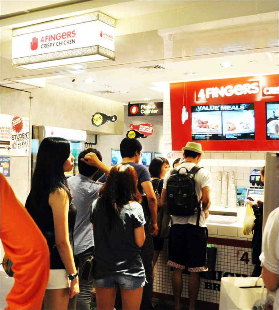
These are pictures of KFC and 4Fingers. Firstly, the logo of KFC is very simple and easy to remember.The colours used in the logo and the store are the same. The main colours used in KFC is red and white. From the store up till the furniture used in the store, the colours used are all the same.
As for 4Fingers, the main colours used are orange and white. Similarly, the store design and furniture also uses the colour theme of their brand.
For Dolce Tokyo, the brand image is high class and elegant. The design of the store uses mainly black and white. Whereas for Smoothie King, the logo is bright and they use a solid font. The store gives off a more relaxed and affordable feel.


0 comments:
Post a Comment